


#ArtDirection #MotionDesign
At Home Alone Together is an Australian comedy series, a satire of lifestyle television in the era of lockdowns, self isolation and social distancing as a result of Covid-19 that’s affected the entire world.
The Opening Titles start with a little nod to our current global crisis, displaying a Covid-19 cell spinning into view. As it spins, it sprouts hundreds of spikes which each spurs the growth of a little house.
We zoom in on one of these houses, and go right through its window to meet each of the main presenters handling a loaf of bread, each in their own ridiculous situations and relevant to their segment theme.
We zoom out of the domestic situations to finally reveal the show logo, set with the TV show’s catchy & upbeat jingle.
Writer: Chris Taylor
Theme song: Eddie Perfect
Producer: Chloe Angelo
For the show look design, I wanted to parody the Aussie lifestyle shows popular in the 2000s as well as the ultra glossy aesthetic that’s often utilised by the main commercial networks on Australian TV (Channel Seven, Nine, Ten)
The colour palette was inspired by 90s Australiana and the paintings of Ken Done. I wanted to find a colour scheme that was equal parts nostalgic and garish!
For the show, I intentionally didn’t want the graphics to feel modern. I wanted to stay away from the current design trends and design something that really felt dated and ‘out of fashion’.
Making graphics for TV comedy requires design rules to be turned on its head. For the show look, I designed the graphics so that they themselves became part of the joke.
I intentionally designed the straps in awkward sizes so that it would often interrupt the framing of the shots. I also used generic stock imagery as overlay in the backgrounds of the straps - the photos helped relate to the segment that was being presented whilst remaining ‘on brand’ with the general 2000s aesthetic.
The super bright colour palette pays homage to the cringy, positive tone usually found in these lifestyle shows. The graphics were designed to give the writers a space to place their jokes for the segments, often contrasting brilliantly with the disgustingly bright graphics that would animate on screen.
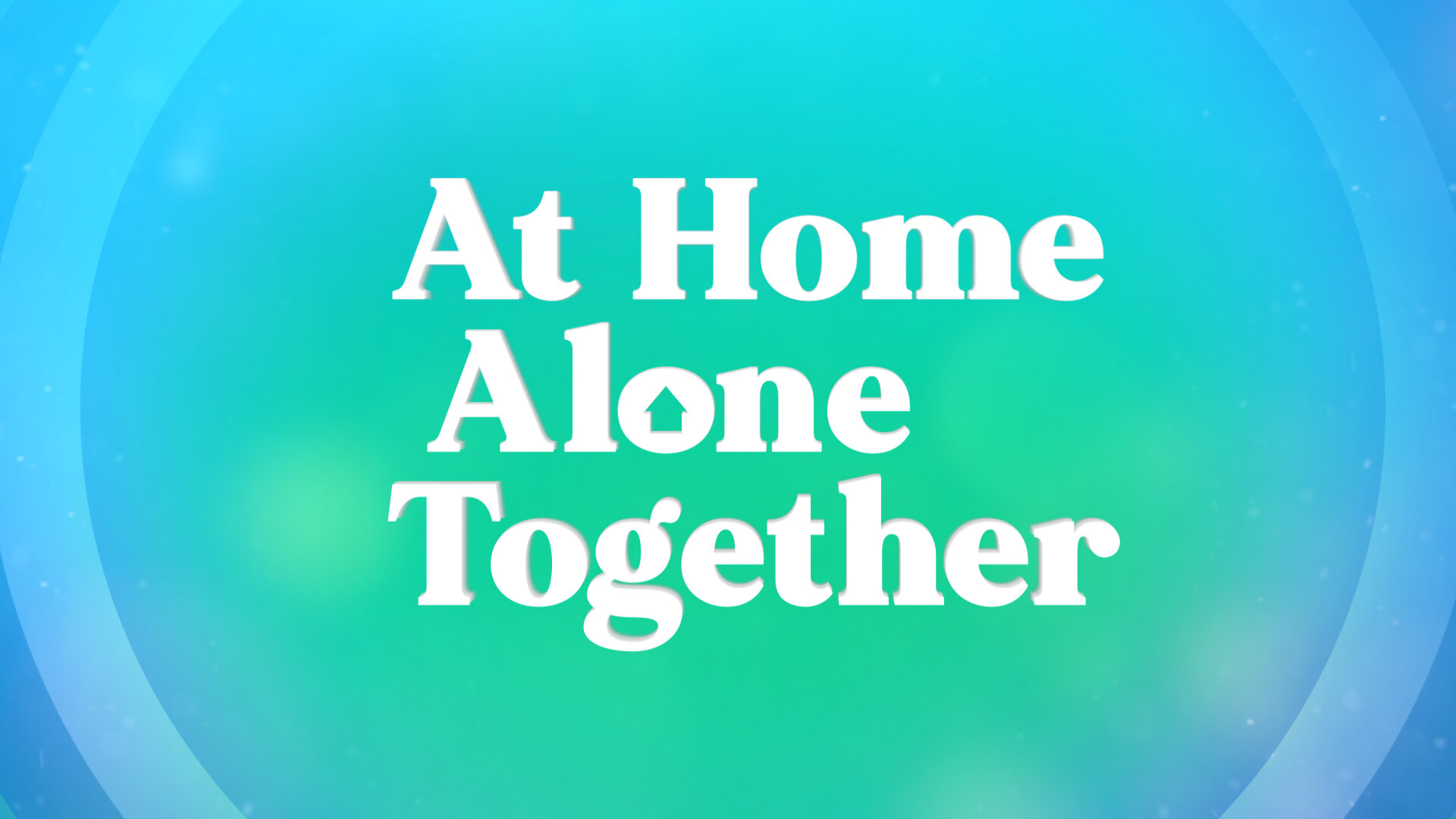
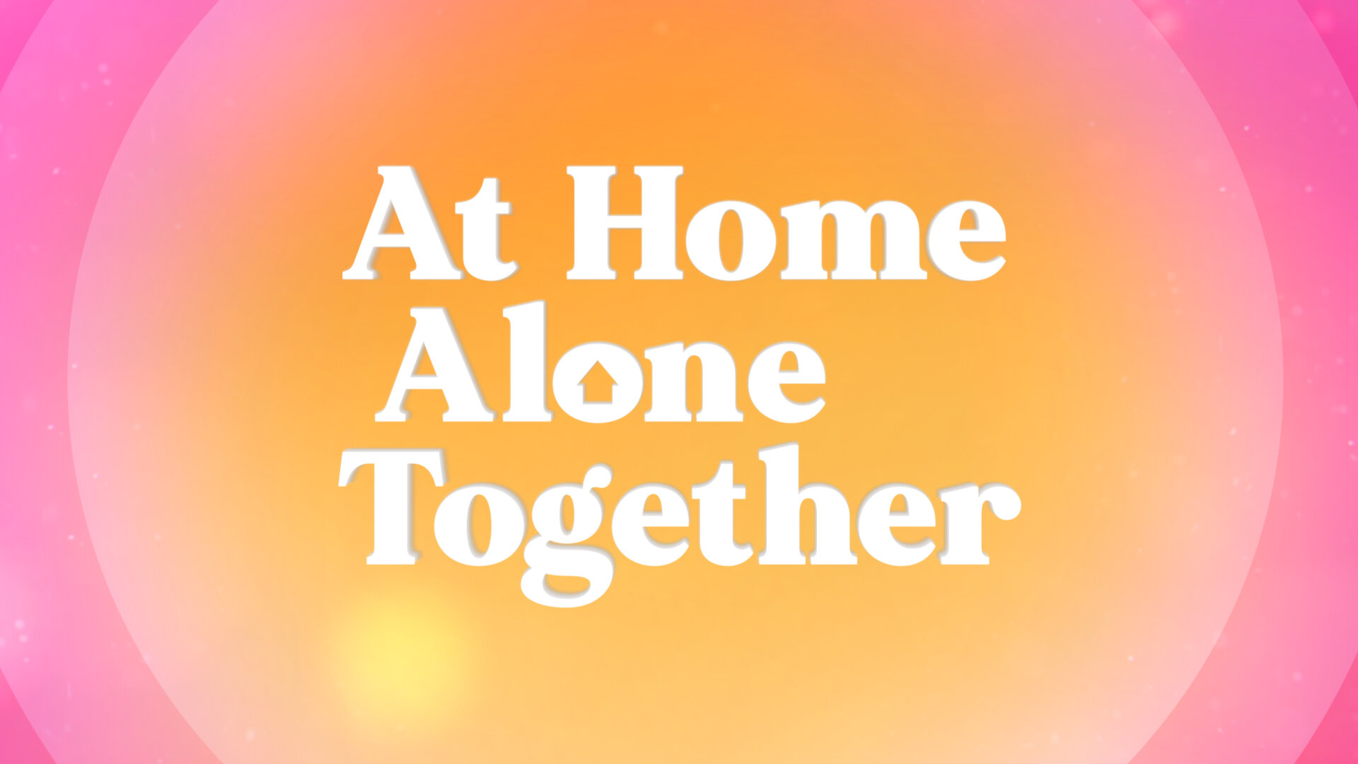
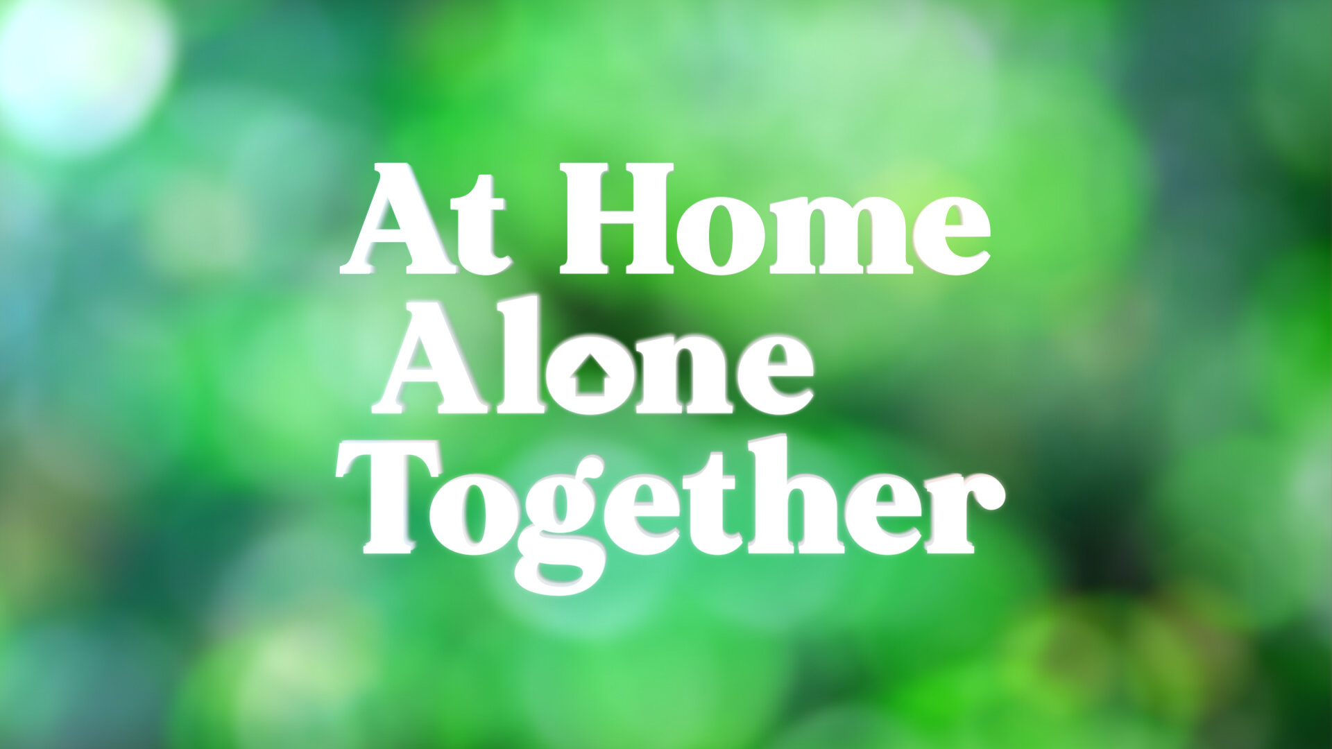
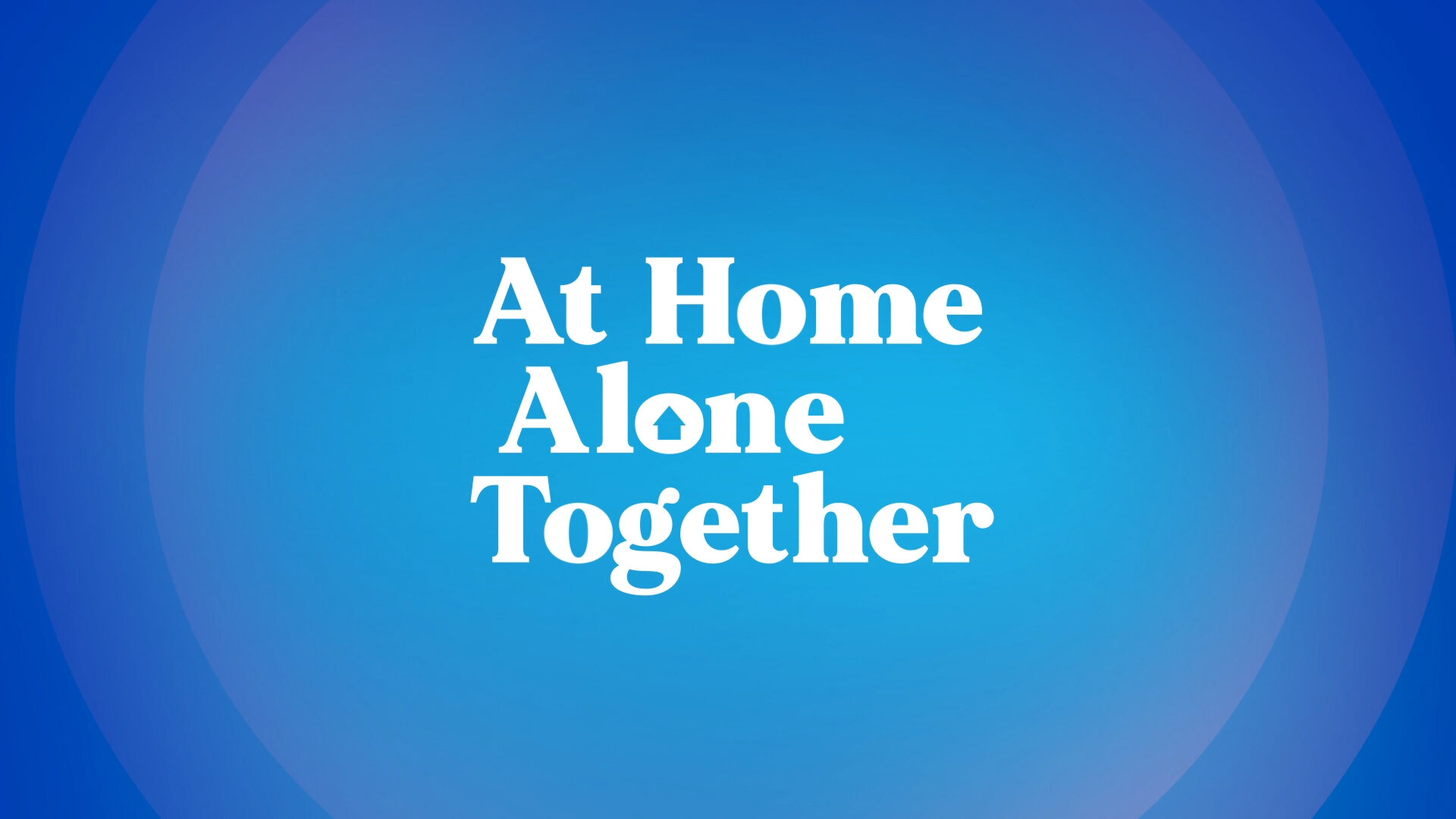
I created a library of Show Transitions that were used at the end & beginning of segments. Using the brand colour palette, I created 4 different variations - each with a different spin on the animation of the show logo.
For the Show Breakers, I worked on creating 2 different versions - one that used the same look from the Show title and the other with an indistinct Bokeh generic background.
I also created the Breakers in the defined Show Colours from the palette so that there was enough variety to alternate between them for the series.
At Home Alone Together Sizzle Reel previewing how the graphics animated on during segments. Enjoy!
Huge thanks to Nikita Agzarian, Janet Gaeta, Nick Hayden & Dan Ilic.