


#Branding #ArtDirection #MotionDesign
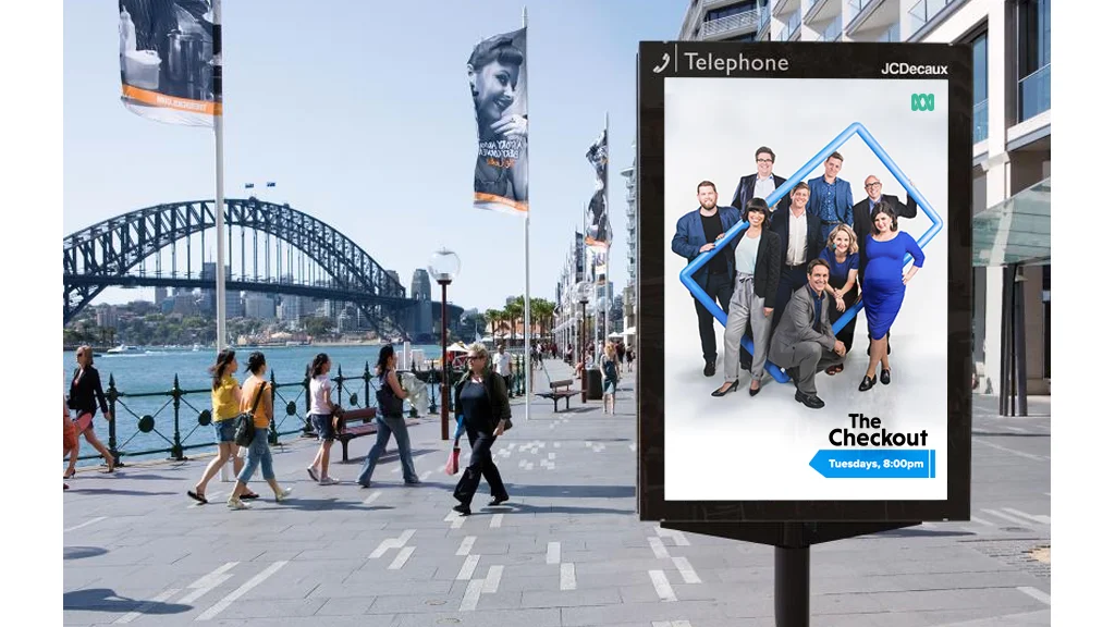
The Checkout is a consumer affairs TV show for the 21st century, examining practices that are misleading, dishonest, unfair or occasionally even illegal.
For Season 6, my role was to lead the show’s design rebrand and lead the design team during production of the 12 episode season from October 2017 to April 2018.
Executive Producer: Julian Morrow
Series Producer: Bec Annetts
Creative Manager: Gabriel Virata Alves
Lead Designer: Missy Dempsey
Motion Design: Daniel Kouts
Advancements in digital technology have changed consumer purchasing behaviours. No longer are we limited to shop in physical spaces but our shopping takes place everywhere - on our phones, in our homes and while we’re on the go.
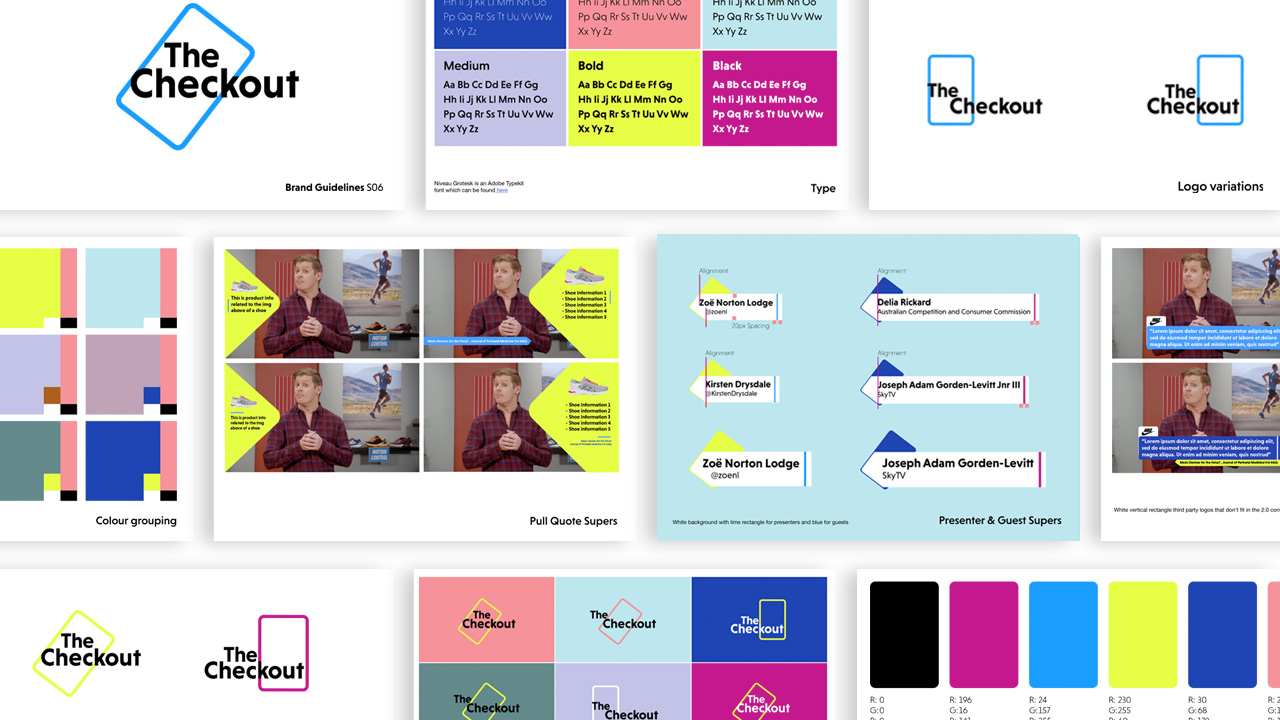
We reflected the evolution of shopping in physical spaces to the digital by also replacing the retro consumerism aesthetic of the previous brand by introducing a bolder, brighter and more modern visual aesthetic.
The Checkout is renowned for exposing false, misleading and hidden claims found in brands and advertising claims.
We chose to reflect this concept visually and introduced a hero “TARR” brand shape - a “rectangle of truth”.
The hero shape was employed in each segment to reinforce the new identity - used throughout the show to highlight important information and as a window of truth to magnify and pull out false or misleading claims.